 The FreeType Project - Bugs: bug #41334, Slightly wrong outline for TT glyph
You are not allowed to post comments on this tracker with your current authentication level.
bug #41334: Slightly wrong outline for TT glyph
| Submitter: | John Tytgat <joty> | ||
| Submitted: | Fri 24 Jan 2014 04:12:26 PM UTC | ||
| Severity: | 3 - Normal | Item Group: | Incorrect behaviour |
| Status: | Fixed | Privacy: | Public |
| Assigned to: | wl | Open/Closed: | Closed |
| Planned Release: | 2.7.0 | ||
![]() Jump to the original submission
Jump to the original submission
|
Fri 15 Jul 2016 08:39:23 AM UTC, comment #14: |
Werner LEMBERG <wl> |
|
Sat 25 Apr 2015 05:58:31 AM UTC, comment #13: For those glyphs, the blue zones don't apply, because there are no real horizontal segments at bottom of the outer outlines of the large round structures, necessary as `anchor points'! Compare `O' with `Q', or `C' with `Ç'. While there are means to manually correct that quite easily in ttfautohint (which is based on FreeType's auto-hinter), the auto-hinter fails more and more if you are going to reduce the allowed deviation from a horizontal straight line. And your patch does exactly that.
|
Werner LEMBERG <wl> |
|
Fri 24 Apr 2015 03:47:55 PM UTC, comment #12: Aren't there a blue zone for all those `Q', `Ç', Ş', `ş', `ę'. I am surprised that they depend on this parameter so much.
|
Alexei Podtelezhnikov <podtelez> |
|
Fri 17 Apr 2015 07:31:25 AM UTC, comment #11:
0. Set up two directory trees for compiling both freetype2 and freetype2-demos. I call them `14' and `32'. Clone the git repositories into those directories. 0. Edit `devel/ftoption.h' and comment out AF_CONFIG_OPTION_USE_WARPER (in both `14' and `32'). 0. In `32', change `afhints.c' to use factor 32 (i.e., apply Alexei's patch). 0. In `14', compile `freetype2' with `make devel; make', then compile `freetype2-demos' with `make'. Repeat this in `32'. This ensures static compilation, avoiding any side effects. 0. I use virtual desktops, and I set up the left one for `14' and the right one for `32'. In both I execute `ftview -l 1 16 *' to scan my Windows font directory using light AA mode. I also open a screen magnifier on both desktops. Now I can switch easily back and forth (with key shortcuts, of course), doing a blink comparison. I'm attaching two images for `georgia.ttf' to demonstrate my setup. As can be seen, the differences are very easy to spot.  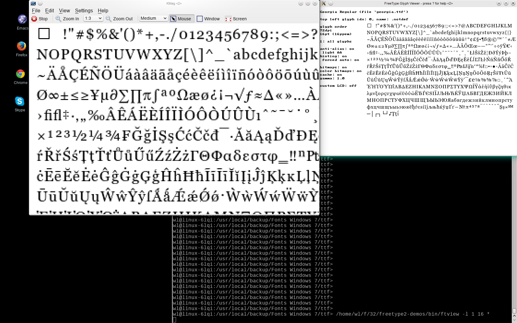 |
Werner LEMBERG <wl> |
|
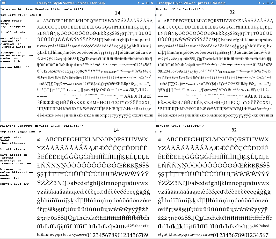
Fri 17 Apr 2015 02:40:07 AM UTC, comment #10: I just do not see as many problems. I see some misses at the top and the bottom of some characters with diacritics, but not all that you mention. I understand how tough it is to judge their (pseudo)extremes. I am puzzled that 4 degree allowance even helps in many (but admittedly not all) cases. |
Alexei Podtelezhnikov <podtelez> |
|
Wed 15 Apr 2015 09:46:28 AM UTC, comment #9: = Value 32 =
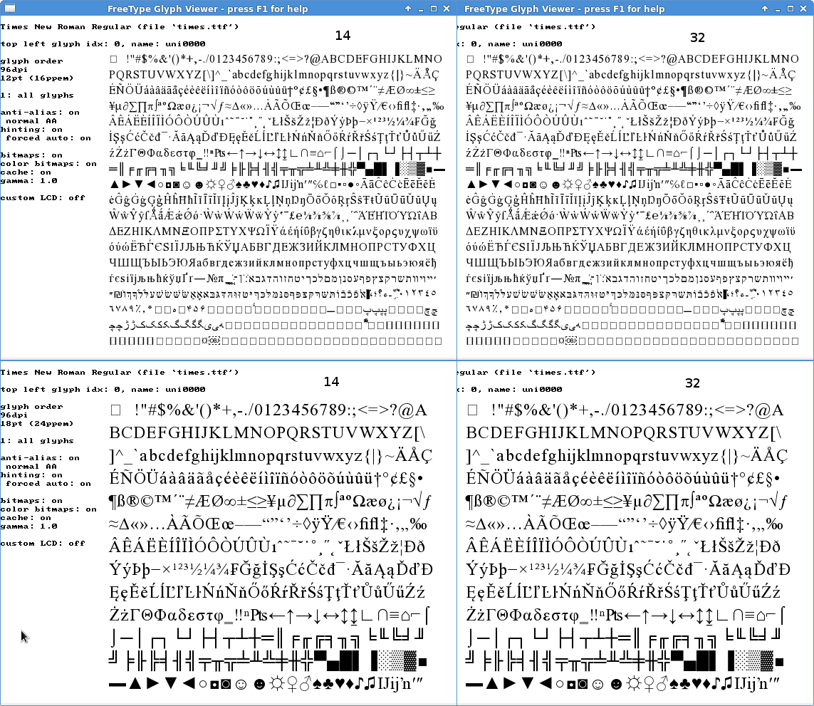
In simsunb.ttf (SimSun-ExtB Regular), the improvements and deteriorations for CJK glyphs are approximately the same. In times.ttf, I see hardly a difference. As a summary, I don't think that value 32 is an improvement for light hinting, which is by far the most important auto-hinting mode. On the contrary: I see a lot of degradations. |
Werner LEMBERG <wl> |
|
Sat 11 Apr 2015 11:40:23 AM UTC, comment #8: Will do so. Please give me some days. |
Werner LEMBERG <wl> |
|
Sat 11 Apr 2015 02:06:48 AM UTC, comment #7: Detailed list of improvements going from 14 to 32:
|
Alexei Podtelezhnikov <podtelez> |
|
Fri 10 Apr 2015 03:28:30 AM UTC, comment #6: I have not found any problems with serifs. In fact E has improved in both times.ttf and papa.ttf. I am ready to test more. |
Alexei Podtelezhnikov <podtelez> |
|
Thu 09 Apr 2015 02:26:00 PM UTC, comment #5: It used to be 12 (4.7°) in the original autofitter commit and changed to 14 (4.1°) in FreeType 2.3.5 without any explanation. I will check for any regressions in serifs.
|
Alexei Podtelezhnikov <podtelez> |
|
Thu 09 Apr 2015 04:41:22 AM UTC, comment #4: Alexei, your fix is overly simplistic, and I object to it as-is since it throws out the baby with the bath water.
|
Werner LEMBERG <wl> |
|
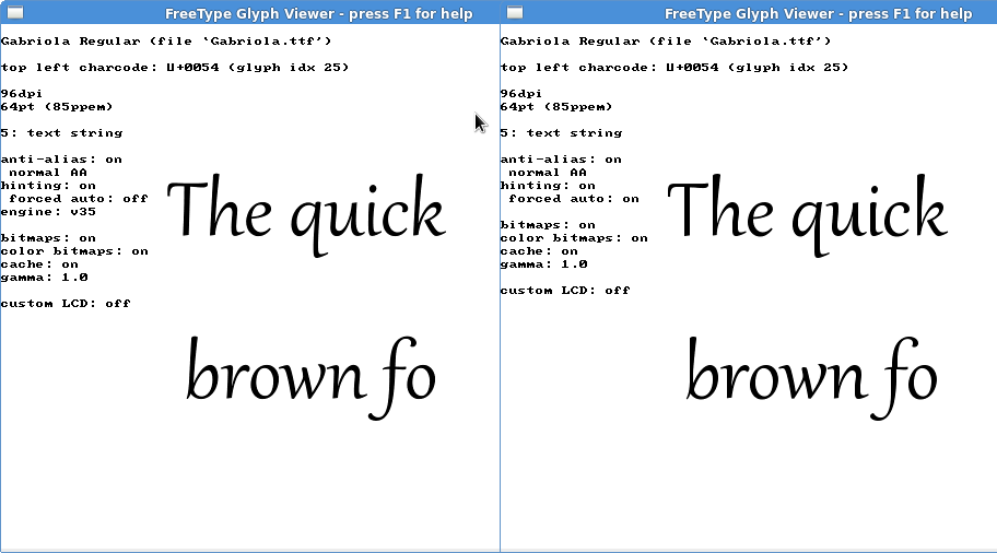
Thu 09 Apr 2015 02:41:51 AM UTC, comment #3: Gabriola.ttf of Windows 7/8 is a font with plenty of sub-4° slants. The attached image shows plenty of distortions caused by overly aggressive autohinting. |
Alexei Podtelezhnikov <podtelez> |
|
Wed 08 Apr 2015 01:57:07 PM UTC, comment #2: I believe that 4.1° slant is too much to be considered vertical. I am attaching a file that shows gradual improvement in rendering as we tighten the angle from 4.1°, to 3.6°, to 2.4°, to 1.8°.
|
Alexei Podtelezhnikov <podtelez> |
|
Wed 05 Feb 2014 06:39:35 PM UTC, comment #1: Without having time currently to analyze it further, I think this is a bug in the auto-hinter algorithm of creating segments: Each line between consecutive on or off points gets a direction: up/down, left/right, or unspecified. The algorithm allows a certain deviation (approx 4°) from horizontal or vertical lines, still counting them as up/down or left/right. Such lines are collected and form a segment; normally, all points along a segment get the same coordinate.
|
Werner LEMBERG <wl> |
|
Fri 24 Jan 2014 04:12:26 PM UTC, original submission:
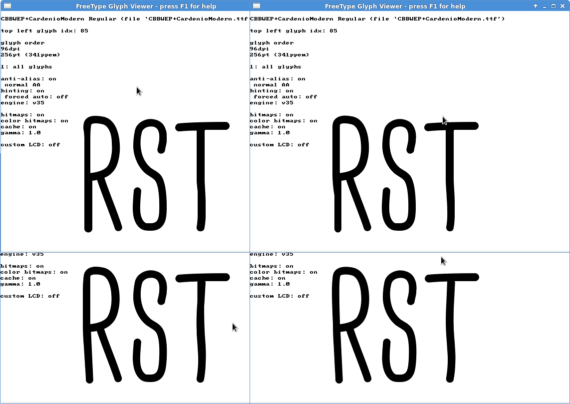
Attached a subset TrueType font which has for its 'R' glyph an outline (using FT2.5.2) which is slightly different than what we see within Acrobat or Windows. I.e. FT makes its left side going a bit right way instead the other renderers make it going a bit left way.
|
John Tytgat <joty> |
Depends on the following items: None found
Items that depend on this one: None found
There are 0 votes so far. Votes easily highlight which items people would like to see resolved in priority, independently of the priority of the item set by tracker managers.
Follow 13 latest changes.
| Date | Changed by | Updated Field | Previous Value | => | Replaced by |
|---|---|---|---|---|---|
| 2016-07-15 | wl | Status | Confirmed | Fixed | |
| Open/Closed | Open | Closed | |||
| Planned Release | None | 2.7.0 | |||
| 2015-04-17 | wl | Attached File | - | Added georgia-32.png, #33700 | |
| 2015-04-17 | wl | Attached File | - | Added georgia-14.png, #33699 | |
| 2015-04-10 | podtelez | Attached File | - | Added times1432.png, #33622 | |
| Attached File | - | Added pala1432.png, #33623 | |||
| 2015-04-09 | podtelez | Attached File | - | Added Gabriola.png, #33608 | |
| 2015-04-08 | podtelez | Attached File | - | Added r.png, #33594 | |
| 2014-02-05 | wl | Status | None | Confirmed | |
| Assigned to | None | wl | |||
| 2014-01-24 | joty | Attached File | - | Added CBBWEP+CardenioModern.ttf, #30362 | |
| Attached File | - | Added screenshot.png, #30363 |
Powered by Savane 3.13-758e.
Corresponding source code

This is now fixed in git, please test!